
How to Create a Stylized, High Contrast Portrait in Adobe Illustrator
Popular among many vector art enthusiasts, the high contrast, with limited flat colors, technique can be used to draw cool-looking, stylized portraits. There are a few different ways this can be accomplished. Here I show you my method using Adobe Illustrator and a reference photo.
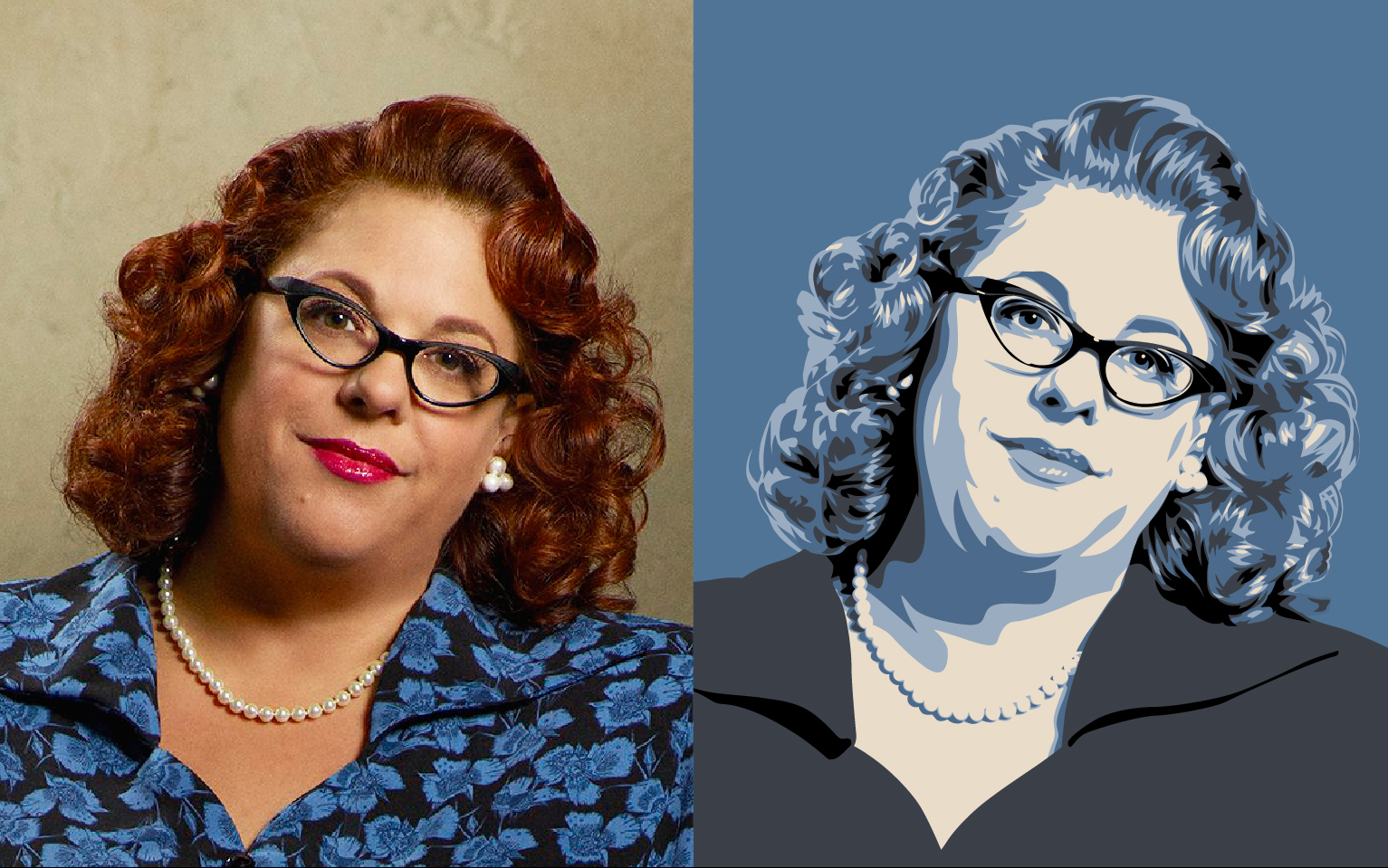
First off, I don’t use the Live Trace function in Illustrator or the Posterize tool in Photoshop. Both are quick ways to achieve similar results but I feel like you are at the mercy of the computer program and how it decides the outcome. I prefer my method – the old-fashioned way – tracing over a photo by hand, with a mouse. This way I have control over how much or how little detail and style I want in the drawing.

I start with my reference photo by placing it into my Illustrator document. Lightening (or ghosting) the photo can make it easier to see what you’re doing when tracing. You can set the opacity of the photo to lighten it in the Transparency panel. Sometimes I do this, sometimes I don’t. It depends on the photo. This photo has been set at 40% opacity. With the photo in place, I lock the layer it’s on so the image doesn’t move as I’m tracing.

Next, I figure out my color palette. The number of colors will determine how many layers I will be tracing and how detailed the drawing will be. The more colors – the more definition. With this drawing I decide on 5 colors. When choosing, think of colors that go from dark tones to light tones. No two colors should have the same tone. In this case, I’m using Black, Gray, Dark Blue, Light Blue and Cream. And, you don’t have to be locked in with your choices. What’s nice about Illustrator is how easy it is to change the colors.
So, the photo’s in place. The colors are chosen. Now the tracing begins. This is where you, as an artist, decide how detailed or stylized you want the drawing to be. On a new layer above the photo layer, I start by tracing the darkest areas first. Using the Pen Tool, I draw lines around all the darkest areas in the photo. I'm using a magenta stroke and no fill so that it’s easier to see as I trace over the photo.

When I finish tracing all the darkest parts of the photo, I remove the magenta stroke and fill the areas I’ve drawn with the first color from my palette, the darkest tone, Black. This is the Black color layer. It will be the top layer. At this point, it might not look like much. Hang in there, it will. (In the examples pictured, the left side shows the traced areas over the photo. The right side shows how the traced areas look together as each color layer is added.)

The next step is to create another layer and repeat the tracing process with the next darkest areas of the photo. Then, delete the magenta stroke and fill with the second darkest color tone, Gray. When done this becomes my second color layer – the Gray color layer. If needed, the opacity of the photo can always be re-adjusted if the levels of darkness in the photo are hard to differentiate when tracing.

I continue drawing a new, separate layer for each color in my palette. Always working from darkest color to lightest color so that the darkest is the top layer and the lightest is at the bottom. As each color layer is completed you can see the image begin to take form. And don't forget, you can hide/turn off the photo layer at any time to check your progress.

At first, it may seem difficult to decide which areas of the photo to trace for which color level. With more practice it becomes easier. Eventually, as you’re tracing one level, you begin to visualize what belongs on the next level. And keep in mind, with Illustrator it’s simple to make adjustments any step of the way.

When the lightest areas of the photo are traced this becomes my Cream color layer. The last color and the last layer. Tracing done. Now is a good time to double check the order of your color layers – darkest to lightest. If it’s out of order one color may be hidden behind another and not show correctly. Yep, I telling you from experience.

Finally, with the tracing complete, I slap on a snazzy background, a few graphic elements and “Boom!” there it is – an awesome portrait worthy of a social media profile pic, business card, or framed poster on the wall of a secret lair.
