Respect to the Rat Fink
Today I'm sharing a just-completed project (and the steps in creating it) for a website dedicated to the 1970s era of skateboarding. It was a blast to work on, not only because of my interest in skateboarding but also, the imagery pays homage to the low-brow style of artist Ed Roth — a huge artistic influence in my childhood.
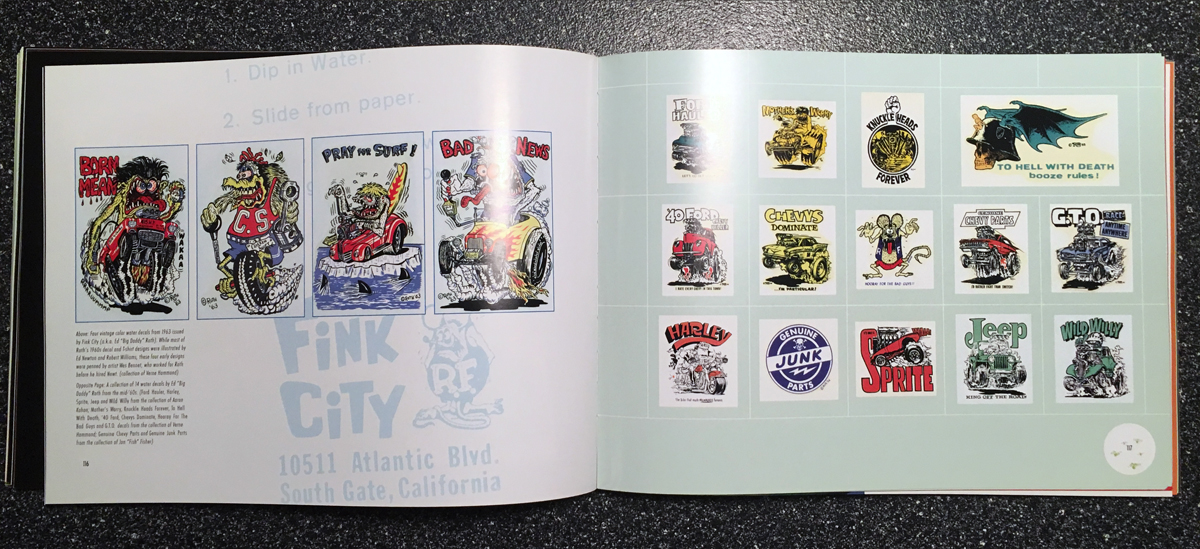
Ed "Big Daddy" Roth (1932-2001) was an artist, cartoonist, illustrator, pinstriper and custom car designer and builder. Roth is best known for creating the hot rod icon Rat Fink and popularizing the "Monsters in Hot Rods" art form. If you were a child in the 60s or 70s you're sure to recognize his grotesque caricatures. And if you're an art book hound like I am, track down a copy of 'Rat Fink: The Art of Ed "Big Daddy" Roth.' There's a few books on Roth but this one has the best retrospective of his life and work and is packed with reproductions of his bizarre monster art and custom hot rods.
Rat Fink: The Art of Ed "Big Daddy" Roth by Douglas Nason & Greg Escalante
Da Mad Taco Skates Again
Reminiscent of both a Roth monster and the 1970s surf culture, the Mad Taco artwork depicts a bulging-eyed, slobbering-tongued, barefoot skater crouched surf-style as he "hangs loose" through an imaginary tubular wave. The graphics will be used on Da Mad Taco Skates Again Facebook page and will be applied to t-shirts, stickers and other promotional items.
Step 1: A loose pencil sketch is drawn, scanned and placed in Adobe Illustrator to be used as a template for "inking."
Step 2: The image is "inked" using the pen tool in Adobe Illustrator.
Step 3: The inked areas are filled with flat colors,
Step 4: Shading is added.
Step 5: Highlights are added using gradient meshes giving it an airbrushed look.
Step 6: A white surround has the feel of a decal that might be slapped on the bottom of a skateboard deck.
And there you have it. Radical, dude!
Here are a few more of my recent assignments that were also heavily influenced by Ed "Big Daddy" Roth...
Sole Handplanes asked for a black & white drawing of a monster-like bodysurfer (left). That way Sole's creative director, Todd could get in on the fun with coloring and typography (right).
Nerd HQ actually has a custom 1960s Ford Econoline van that makes appearances at Southern California pop-culture conventions. So, this graphic was a must.
Color variations for the Faces of Drummers brand image.


