This year at San Diego Comic-con will always be remembered as "The Year of Wynonna Earp.” Back in May, the SYFY channel…
Read MoreOver the years, I’ve come across vector files for logos that haven’t been completely finished. I’ve found there are three common production steps that many designers forget, or don’t know, to do…
Read MoreI blogged about Logo Mathematics before – when imagery that represents a business, service or product is combined with…
Read MoreHere's a throwback story to Sci-Fi Fridays and my involvement in a fan campaign to save a quirky little sci-fi TV series called Farscape...
Read MoreI’ve been working on some icons that will be used on infographics explaining one company’s methods of raising premium Atlantic Salmon. This project is another reminder that visual content makes...
Read MoreWhen I first start working on a new logo assignment, a design method I turn to is what I like to call Logo Mathematics...
Read MoreToday I'm sharing a just-completed project for a website dedicated to the 1970s era of skateboarding. It was a blast to work on, not only because of my interest in skateboarding but also, the imagery pays homage to the low-brow style of artist Ed Roth...
Read MoreLast week a client asked me to design a brand graphic, with their logo, to be applied on a fleet of vehicles. They sent me their logo in all types of file formats. Problem was, all were...
Read MoreI graduated from high school in 1977. Most classmates signed my yearbook with a “Let’s hang out.” or “Have a nice summer!” But my friend Kim wrote, “May the force...
Read MoreI recently completed a logo design for San Diego’s premier travel agency, Kahala Travel. The company is celebrating its thirty years in business (and $19 million in sales!)...
Read MoreAs Ratscape, I began creating pop-culture themed artwork and shared it on various message boards, websites and social media platforms. Over the years, the art caught on...
Read MoreThe logo was applied to a few marketing elements and a soft launch of the new business was performed. This is when the problem arose. Soon after, the client received a cease and desist letter...
Read MoreWhen is a good time to redesign your logo? In the case of Gentry Commercial Real Estate – the 5-year old company had become a top-tier presence in the Central region of Virginia – they had outgrown their old logo. They knew...
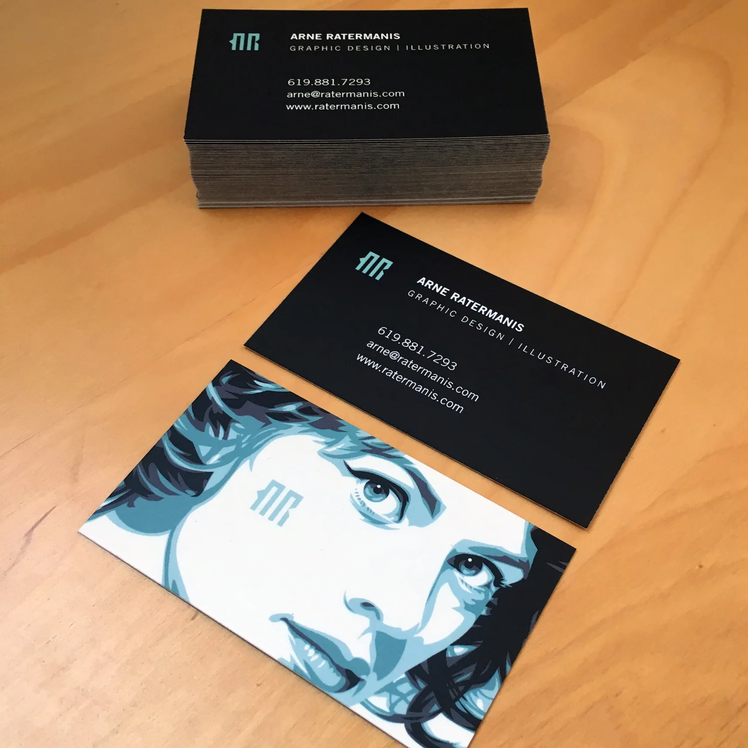
Read MoreThe new logo has been designed. The website is up and running. Next on the to-do list – business cards. A business card can mostly likely be the first impression people make of you and your business. As a graphic designer, I believe...
Read More


