Vector vs Raster: What’s best for your logo
It happened again. Last week a client asked me to design a brand graphic, with their logo, to be applied on a fleet of vehicles. They sent me their logo in all types of file formats. Problem was, all were in “raster” formats – TIFF, JPEG, PNG, and GIF. What was needed for the project was a “vector” file – AI, EPS, PDF, or SVG. The client had never been supplied with a vector file.
What’s the difference?
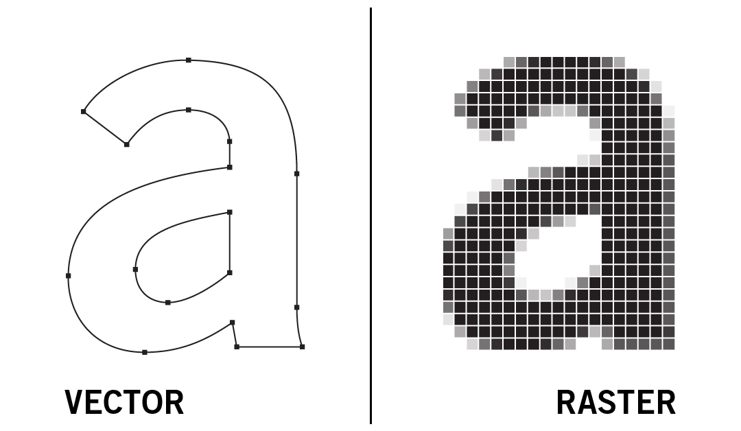
Raster images are made of hundreds of tiny colored squares, referred to as pixels or dots. Each pixel is coded with a specific color. Grouped together on a grid, the many pixels compose the image. Perfect for photographs. Because the grid is so small, the individual pixels are not visible to the eye. But when enlarged, the grid becomes more noticeable and the image appears fuzzy or pixelated.
Vector images are made using mathematical paths. Shapes are drawn using points, lines and curves. Because of the formulaic approach, a vector image is infinitely scalable without loss of resolution. It also has a smaller file size (contains less data versus raster), and is editable with a vector program like Adobe Illustrator.
So, who cares?
In the case of the vehicle graphics project, the logo would be applied at a large size. The raster-formatted files were too small. If the logo was enlarged it would become pixelated and appear blurry. Unfortunately, because the client was never given a vector file, I had to redraw the logo. Not a problem. Just sucks for the client – having to pay for the production of the logo art twice.
When the raster image is at the appropriate size for it's resolution it will appear the same as a vector image.
When the image files are scaled to a larger size, the quality of the vector image remains the same while the raster image becomes blurry due to the enlarging of the pixels.
It still surprises me how common this sort of thing happens. I had a conversation recently with another small business owner. He explained how, immediately after his new company logo was designed and paid for, he hired another graphic designer to draw it in vector format. His logo designer wasn't able to. Again, another logo produced twice – costing the client more time and money.
In my opinion, a solid logo designer knows a master vector file is optimal AND knows how to produce one. In most cases, if a logo is embroidered, silk-screened, engraved, vinyl-cut, or resized for print or web, a vector file is needed. It just makes sense – a logo should have a master vector file. Just about all other graphic file formats can be created from a master vector file.
So, two takeaways here... First, If you're on the client side and looking for a logo designer be sure they can provide the final art in vector format. It seems like a silly question nowadays but, obviously, still a necessary one to ask. And second, if you're a budding logo designer – get with the program! ...Something like Adobe Illustrator.
This example shows the same results occur when enlarging a very simple, one-color logo design.
One last note – a vector file can be converted into a raster file BUT a raster file cannot be converted into a vector file. And – saving a raster image as an EPS or PDF does not make it a vector.
Raster good. Vector better.


